Pickles & Honey
Are you just here for the food?
With over 500,000 unique monthly visitors Pickles & Honey isn’t your friend’s food blog, but it might be the food blog your friends read. However, website traffic has slowed for food-influencers, so we were tasked with making the site a recipe resource as well as a creative outlet.
User Interviews
User Testing
System Usability Survey
Information Architecture
Contextual Inquiry
Wireframes
UI Design
Prototyping
Project Management
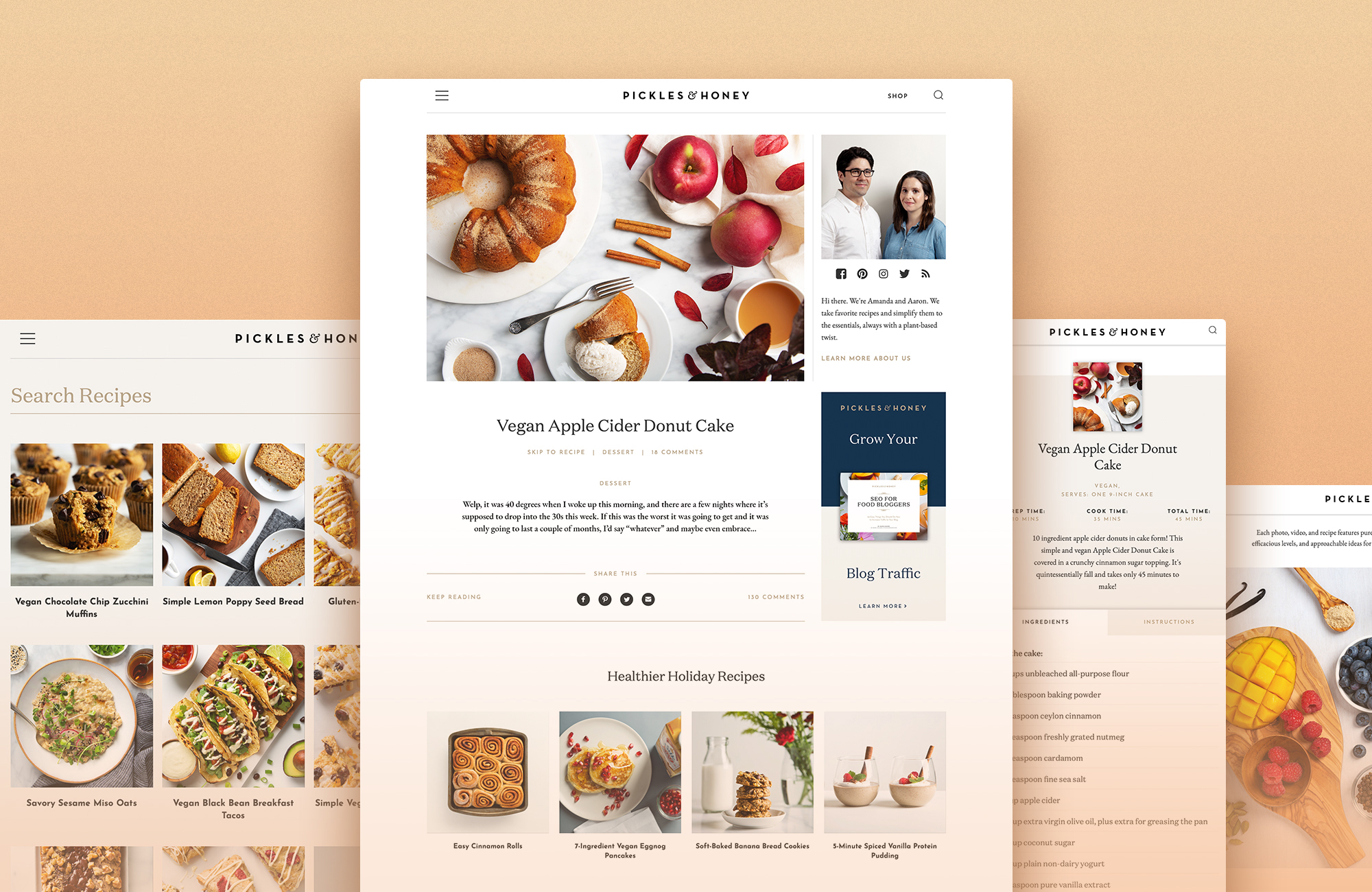
Final Homepage Design
Surprising survey results
We gathered a dozen site users, interviewed them, and gave them a task to perform (finding a recipe for dinner this week) to help us understand how people felt about the site. We also sent out System Usability Surveys, with startling results. All responses for question 3 “I thought the system was easy to use” came back as “Strongly Disagree.”
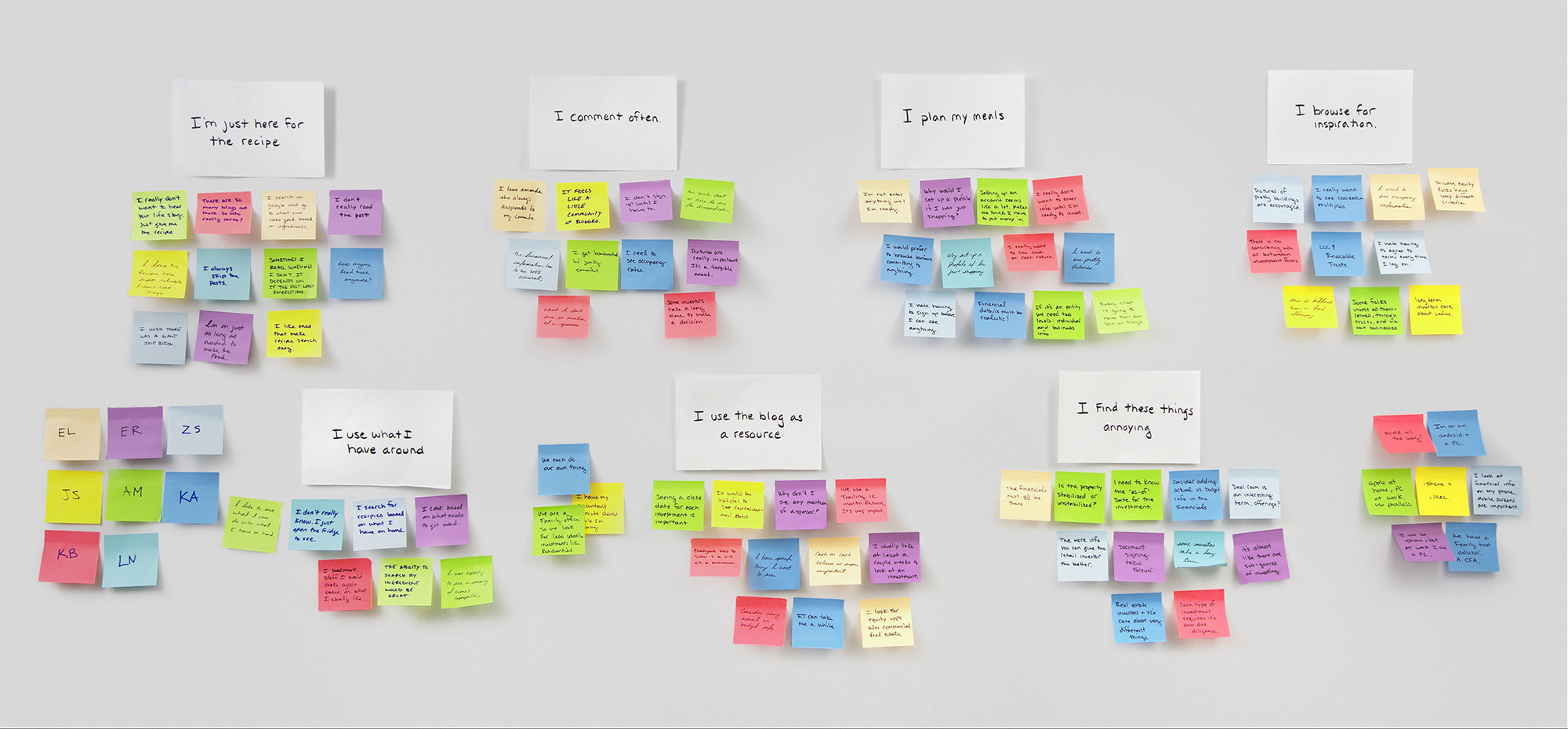
Affinity Mapping
Synthesizing everything we learned
Users hate the site search. We learned in subsequent interviews that the poor survey result was tied to difficulty using the site’s internal search. Many users said they just Google the recipe they want because it’s easier than using the site.
Most users don’t plan their meals. While they find the site inspirational, when it’s time to actually cook they base their decisions around what they have on hand.
This isn’t a relationship. 77% of site traffic arrives through organic search. These users are task oriented, time sensitive, and hate having to scroll to find a recipe.
This really is a relationship. 23% of site visitors subscribe to the newsletter and regularly read posts. While they are “here for the food”, they also feel like they know Amanda (the author) and take the time to read, engage, and comment. That personal connection is important to them.
These users broke down into distinct personas.
Personas
Friends
I’ve been following your blog for years. I feel like I know you even though we live on opposite sides of the country.
-ErinThese users visit the site regularly and use it as a resource. While “friends” are the minority, they are the source of most site engagement.
Noteworthy Behaviors
Many users still like to print out recipes.
Potential Insight
Making the site more valuable to these users would require reducing the friction of a poor internal search tool, finding a way to present content in categories they are likely to be interested in (such as by season, holiday, or time of day), and making sure they can print recipes easily.
Acquaintances
I don’t want to hear your life story. Just give me the recipe please.
-HannahThese users arrive on the site through organic search and want the recipe immediately. While they rarely engage, they are the majority of the site’s visitors.
Pain Points
Most users are frustrated by having to scroll up and down repeatedly while trying to view recipe instructions and ingredients.
Potential Insight
These users are goal-oriented. Bypassing non-recipe content may be the only way to keep them from bouncing off the site.
Our Goal
Our goal was clear: make the site a resource to “Friends” by designing into their existing behavior while not getting in the way of task-oriented “Acquaintances.” Here is how we did it.
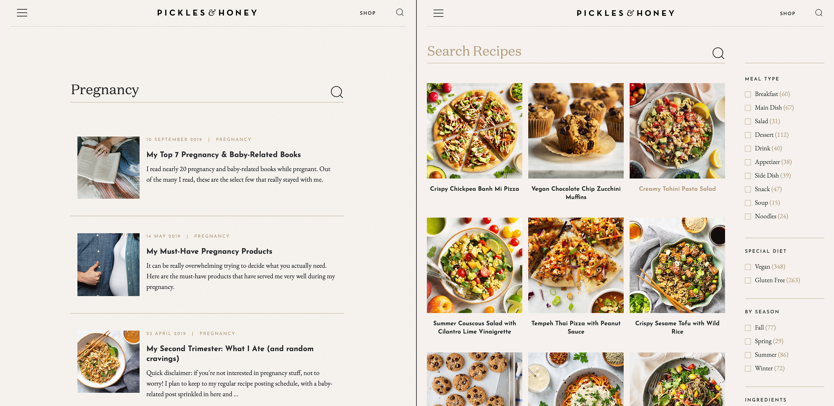
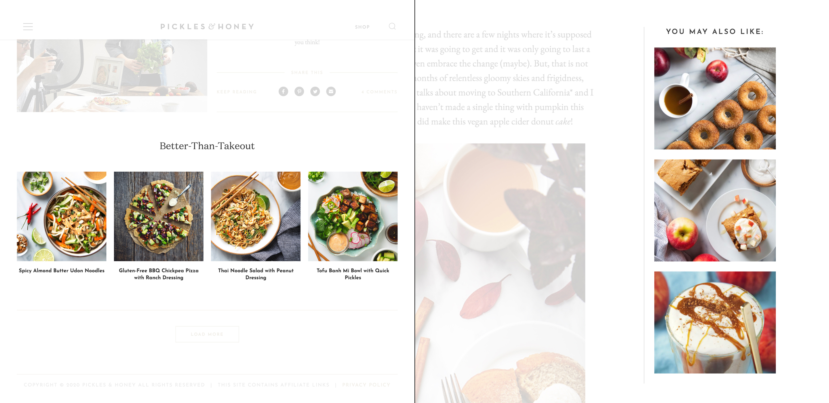
Site Search (left), Recipe Search (right)
Fixing Search
We began by separating site search from recipe search to make each type of content easier to surface. We also made recipes filterable by meal type, diet, season, and ingredient.
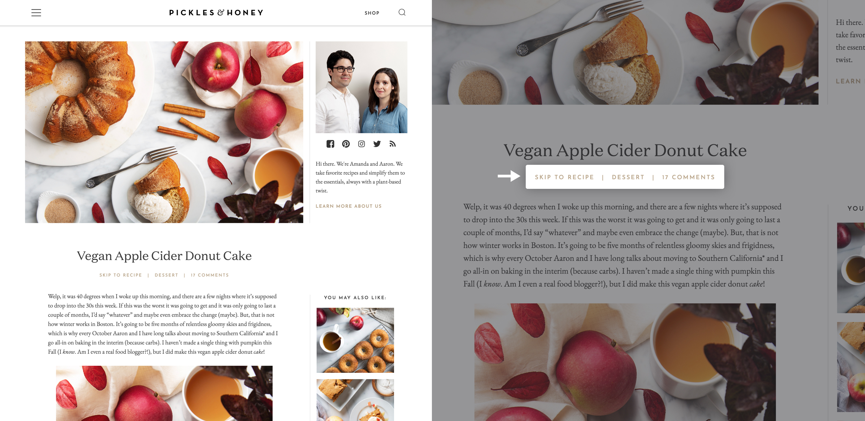
New post layout with skip button
Skip to Recipe
We inserted a “skip to recipe” button immediately under the recipe title allowing organic search visitors to bypass content they don’t care about.
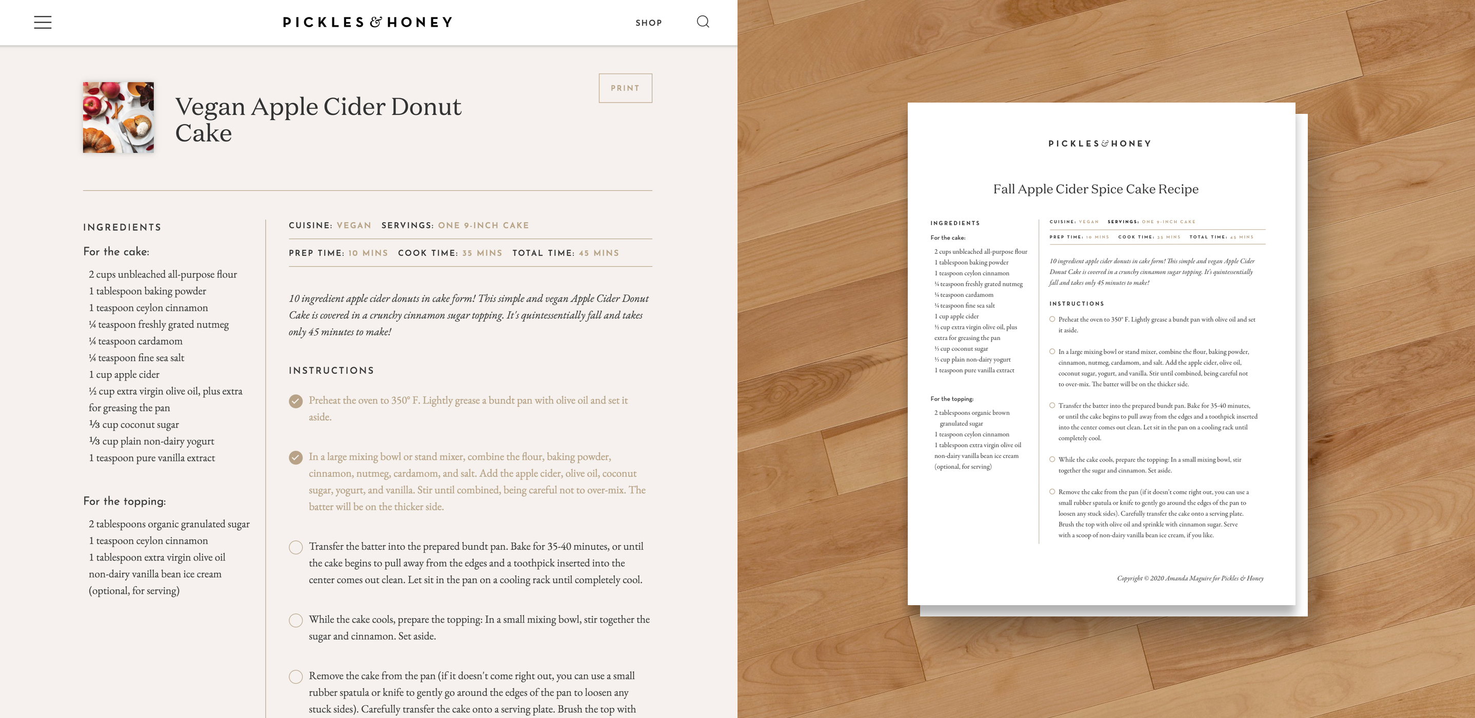
New Recipe Layout and Printable Version
Functional Recipe Layout
We redesigned the recipe layout to accommodate laptop users and mobile users who are actively cooking.
For laptop users we put ingredients and instructions side by side to minimize scrolling, added a checkmark feature to the instruction list, and made sure the print button was obvious (and the printed result looked as good as the site).
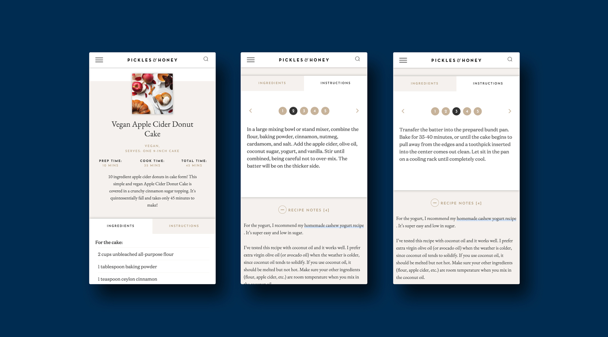
Skip button with Checkbox Instructions (top) & Swipable Mobile Recipe Layout (bottom)
While it was impossible to remove all scrolling from the mobile experience, we dramatically reduced scrolling by tabbing the ingredients and instructions. We also made the instructions swipe-able so mobile users would never lose their place.
Flexbile Content Modules
Refreshing Content
To address the author’s inability to re-post successful content we coded override options into the homepage and inserted flexible content modules to house seasonal, or holiday posts that had no place to “live” after their original post date.
Final Homepage
"We saw a big increase in time on site."
In the first month post-launch the site saw an increase of 45 seconds in Average Time On Site, a 7x increase in commenting, and double the preceeding month's email sign-ups. Amanda’s reaction to the launch sums up our feeling about it: “Oh, this is so much better!” We are currently researching the viability of a Saved Recipes feature within a user profile as well as providing nutritional information as a feature for signed-in users.